← Tanuki Works

BUILD NOTES / SELECTED TECHNICAL WORK

Making the difficult
feel simple.

The interface is the visible part. These notes cover the constraints, tradeoffs, and lessons behind six of my most involved builds.

01 / Game systems & sustained iteration

Sporeling Dash

One dash became a movement system. That system became a 15-chamber world.

Live browser game · My most sustained game project
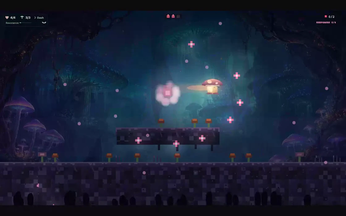
A boss encounter captured from Sporeling Dash gameplay
THE SYSTEM, AT A GLANCE01Dash & grow a platform02Chain movement abilities03Master chambers & bosses04Return for harder trials
The Lonely Chorus boss encounter, recorded from a local playtest of the running game. Silent preview.
70+Recorded Git commits
15Adventure chambers
4Main-route boss encounters

The challenge

The central idea sounds simple: dash in the air and grow a temporary mushroom platform beneath your landing path. Making it feel good meant coordinating momentum, collision, limited resources, and platform lifetimes. Every new ability changed which routes were possible, where players could recover, and how easily a level could be bypassed. This became the game I spent the most time developing and revisiting.

The approach

I built outward from that movement loop, then repeatedly revised the game around how it played. The development history records passes on dash buffering, camera behavior, checkpoint spacing, boss attack cues, touch menus, and difficult routes. Later expansions added new enemy chains and advanced trials, followed by fixes for failed-attempt resets and unintended shortcuts. The V5 visual remake brought a luminous illustrated environment while preserving the underlying 2D gameplay.

What came out of it

The result is a browser platformer with 15 Adventure chambers, four main-route boss encounters, two hidden rooms, persistent keepsakes, and two unlockable challenge routes. Timed runs add separate route leaderboards and optional personal-best or champion ghosts. More than 70 recorded Git commits document the progression from a small fungal platformer to a much larger game, including repeated balancing, accessibility, presentation, and control improvements.

What I learned

Adding a mechanic is the start of the work. The harder part is teaching it, combining it with everything already in the game, and making failure feel fair. A boss needed an attack opening players could read; a long traversal chain needed its connectors to reset after a fall; a phone menu needed to work with a thumb. Those revisions taught me more about building a complete experience than any single feature.

The systems behind the game

Built with frontier AI, refined through play

I used frontier AI as a development partner to explore movement systems, work through implementation details, and build regression checks. The work came down to concrete decisions: how air dashes create bloom platforms, how collisions behave at ledges, how bosses signal an opening, and how touch controls preserve the intended dash direction. My role was setting the direction, judging the feel, and turning playtest feedback into the next iteration.

Movement that creates the route

Midair dashes grow temporary bloom platforms. Wall-cling, spore-glide, a flutter jump, and a straight-down slam extend the traversal vocabulary. Enemy bounces and dash refunds turn gaps into linked movement sequences.

Combat feeds traversal

Adventure’s Resonance meter rewards enemy interactions and bloom chains. A charged burst clears nearby ordinary enemies, restores movement resources, and lifts the player. Boss encounters teach distinct openings and attack responses.

Difficulty with different priorities

Adventure offers three difficulty settings with different health, healing, and checkpoint rules. Timed Run keeps its clock running through deaths. The Pale Root and The Reach push the same mechanics into longer, less forgiving routes.

A reason to come back

Hidden rooms, four persistent keepsakes, separate Any% and 100% boards, and recorded ghosts give players different goals. Longer routes keep their own leaderboard categories so unlike runs are not ranked together.

Testing the actual routes

Deterministic route replays and engine-level probes check chamber progression and advanced challenge segments. Focused checks cover repeatable physics, bloom placement, collision boundaries, touch inputs, and fullscreen behavior, making the movement system easier to revise without losing working routes.

Built for more than a keyboard

Keyboard, gamepad, and touch inputs cover play and menus. Later revisions improved mobile text, tap targets, audio startup, fullscreen behavior, and the HUD so the interface left more room for the route.
Explore the project ↗

02 / CRM & operational tools

Connected Business Platform

Build the tools around the work, then make the connections dependable.

Live business tools · Private workspace · Public system overview
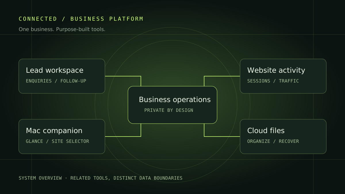
Conceptual overview of CRM, website activity, companion apps, and cloud file workflows
THE SYSTEM, AT A GLANCE01Website enquiries02Private lead workspace03Live activity monitoring04Desktop companion
The working analytics interface, shown with synthetic demo data. Explore the globe, switch sites, and inspect page activity and recorded actions.

The challenge

Running a business means moving between enquiries, website activity, conversations, and documents. The challenge was making that work easier to follow without exposing staff information or turning every task into another dashboard to maintain.

The approach

I built a private lead workspace alongside the public website, then connected authenticated activity endpoints to the web dashboard and a native Mac companion. The site selector keeps each website’s readings separate. Cloud Cabinet and local file-organization workflows handle the document side as related tools, rather than pretending everything already shares one database.

What came out of it

The working toolkit includes lead management, visitor conversations, multi-site traffic reporting, and a floating desktop activity panel. Active sessions are measured over the last five minutes; historical visits and page views come from a separate analytics feed. Cloud storage, version recovery, and automatic file organization support the wider workflow. This overview shows the system’s structure without publishing the private workspace.

What I learned

A connected product needs clear boundaries as much as shared features. Switching sites must clear old readings, unavailable data must not look like zero traffic, and public pages must never inherit staff access. Building across the browser, desktop, and storage workflows made those details central to the design.

Explore the project ↗

03 / Storage & recovery

Cloud Cabinet

The hard part of a file library is earning trust when something goes wrong.

Public beta · Built from a working private file-library project
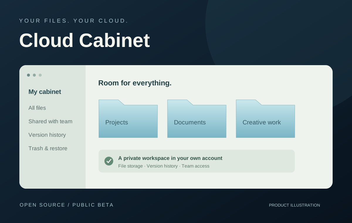
Cloud Cabinet folders, version history, and private cloud storage
THE SYSTEM, AT A GLANCE01Files and folders02Controlled access03Version history04Recovery

The challenge

Replacing a familiar file workflow meant thinking beyond upload and download. People need to find the right document, keep access under control, and recover from mistakes. A polished folder view is only useful if the system behind it behaves predictably.

The approach

I built the project around a browser-based library with a separate storage layer and file index. The earlier private library put particular emphasis on interrupted transfers, recoverable deletion, and keeping source records during migration. Those constraints shaped Cloud Cabinet’s focus on organization, version history, and team sharing.

What came out of it

Cloud Cabinet is available as an open-source public beta that can be deployed into the owner’s own Cloudflare account. It provides a file workspace with folders, version restoration, and sharing. The private predecessor also gave me a real migration workflow to test against, rather than designing only around sample files.

What I learned

Recovery is part of the product, not a maintenance task. I learned to ask what happens if a transfer stops, a filename changes, or someone needs an older copy before treating the happy path as finished.

Explore the project ↗

04 / Connected product systems

Grogan & Grogan

Make search, property information, and conversations feel like one product.

Live platform · Continuously developed
Grogan & Grogan property presentation at sunset
THE SYSTEM, AT A GLANCE01Property discovery02Listing context03Visitor conversation04Staff workspace

The challenge

A real-estate website has several audiences at once: someone exploring a neighborhood, a buyer asking about a particular property, and the team following up. Adding features independently can scatter the context across forms, inboxes, and dashboards. The challenge was connecting those flows while keeping private staff tools private.

The approach

I extended the existing platform rather than creating a disconnected tool for each feature. Property conversations retain their listing context, staff availability expires instead of staying misleadingly online, and notification messages avoid carrying private conversation content. Search, enquiries, and staff follow-up each have clear boundaries.

What came out of it

The live platform brings property search, listing experiences, visitor conversations, and staff workflows together. Release checks covered ordinary page access, rejection of unauthenticated admin requests, and blocked cross-origin writes. Notification delivery on a specific phone remains a separate real-device check, not something a successful server response proves.

What I learned

The connections between features are often harder than the features themselves. A useful system needs clear ownership of data, honest availability states, and a plan for retries and missed messages. Those details are what make the experience feel coherent.

Explore the project ↗

05 / Native telemetry & visualization

Fieldstation

Turn a stream of hardware measurements into something you can actually read.

Native Mac prototype · Runs locally
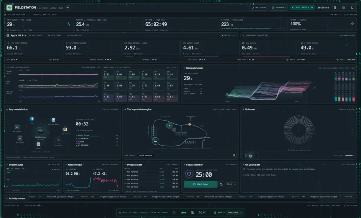
Fieldstation local Mac sensor dashboard with charts and kinetic instruments
THE SYSTEM, AT A GLANCE01Local Mac sensors02Measured samples03Rolling history04Interactive instruments
A 47-second tour of the native Mac dashboard, from live sensor histories and compute terrain to the app constellation and kinetic instruments. Recorded in Anonymous mode, with music.

The challenge

Hardware readings arrive at different rates and do not all mean the same thing. Some are instantaneous, some accumulate, and some may be unavailable. I wanted an expressive dashboard that stayed faithful to those differences, without turning a beautiful animation into a misleading measurement.

The approach

I separated collection from presentation. Local collectors supply the readings; the interface keeps histories and turns them into charts, a terrain of CPU activity, and kinetic instruments. Missing or stale sensor data is marked. Unknown app and process names are anonymized before they reach the interface, and personal notes can remain masked.

What came out of it

The native app brings CPU and GPU temperatures, clocks, power, memory, fans, network traffic, and app activity into one local control surface. The portfolio recording shows real readings in Anonymous mode. The numerical displays are telemetry; the marble relay and ring sculpture are decorative simulations. The live feed stays on the Mac.

What I learned

A visualization needs a clear contract with its data. Smoothing can make motion readable, but it should not conceal missing measurements or imply precision the sensor does not provide. Privacy also works better when built into the data path instead of added as a visual cover.

Explore the project ↗

06 / Real-time interaction

Ghost Conductor

Make camera input feel like an instrument, not a settings screen.

Live browser experiment · Camera interaction
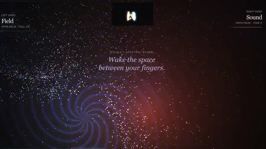
Ghost Conductor recording with tracked hands and a particle spiral
THE SYSTEM, AT A GLANCE01Camera input02Gesture interpretation03Sound & particles04Visible feedback
A 13-second recorded performance. Tracked hands shape the particle field. Audio removed for this showcase.

The challenge

Camera input, gesture interpretation, audio, and a particle field all need to agree quickly enough for the interaction to feel responsive. Phones add smaller screens and tighter rendering budgets. Even a camera preview can become a problem if it covers the very experience it is meant to support.

The approach

I treated interaction feedback and mobile layout as part of the core instrument. Different gestures have distinct responses, while the phone camera view is a small corner tile that preserves the hand framing. Release checks exercise gesture states, audio activation, and recording, alongside the checks that keep diagnostics out of the public build.

What came out of it

The public experience combines hand-driven sound and particles with clap, snap, and finger-wiggle interactions and a recording flow. Automated interaction checks help catch regressions; they do not replace testing a real camera, lighting conditions, and phone. Mobile layout work reduced the preview’s footprint without changing gesture detection settings.

What I learned

In a real-time interface, feedback is the explanation. I learned to evaluate the entire loop, from input through visible response, and to treat screen space and startup behavior as engineering constraints rather than final styling details.

Explore the project ↗
← Back to the collection